Modern web development often feels like a story of endless addition: adding another javascript framework, another virtual DOM library, another layer of complex abstraction just to render a simple interface on a screen. But occasionally, we need to ask ourselves a vital question: What happens when we strip it all back?
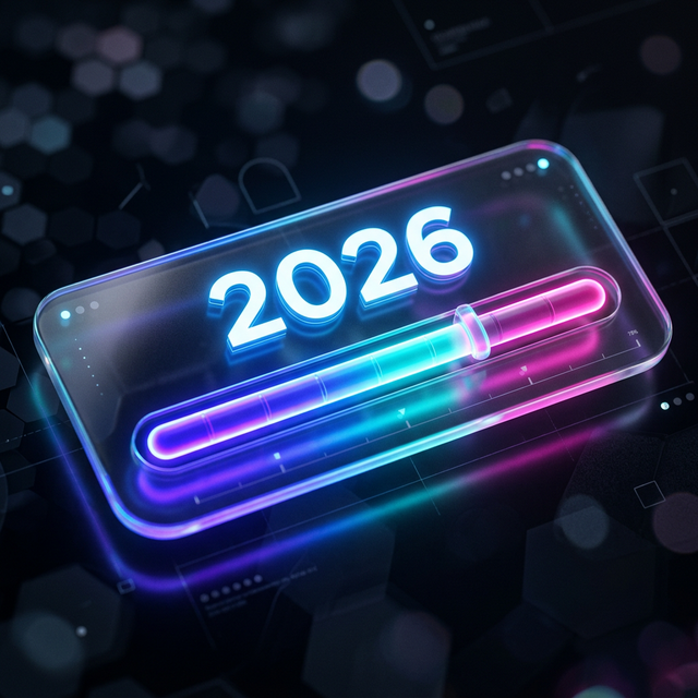
I recently set out to build something deeply satisfying, computationally perfect, and visually engaging. The result is Year Progress, a lightweight, dramatically themed web application that tracks the exact percentage of the current year that has elapsed.
My goal was uncompromising: No heavy frameworks. Just sheer, unadulterated web-native code. And it had to achieve a perfect 100 score across every single Lighthouse category: Performance, Accessibility, Best Practices, SEO, and PWA.
Finally, I wanted it to belong to the public domain. It is released under The Unlicense—no rights reserved. Do with it what you want.
Here is a deep dive into how I hit technical perfection, as told through the architecture and the commit history.
The Foundation: Raw HTML, CSS, and TypeScript
Year Progress is built on a lean Vite setup. No React, no Next.js, no Vue. The DOM structure is written in raw HTML, the logic is handled by a single main.ts file, and the entire aesthetic is driven by a massive, meticulously crafted style.css file.
The application features five distinctly radical themes:
- Glassmorphism: The default, featuring Vision OS-style frosted glass cards set against fluid, 15-second animated gradient blobs rendering behind the blur.
- Vaporwave: An aggressive nostalgia trip complete with a Windows 95 title bar (complete with functional-looking minimize/close buttons), a CSS-perspective checkered grid, and a neon sunset gradient.
- 80s Digital: An homage to classic LED alarm clocks, utilizing the
DSEGsegment font family with intense crimson drop-shadows to simulate glowing hardware. - Cyberpunk: A brutalist, scavenged-tech aesthetic featuring concrete textures, neon cyan and magenta accents, a glitching "Hologram Ad", and literal duct-tape visual greebling achieved purely through CSS pseudo-elements.
- Terminal: A high-contrast, pure text readout that even converts the progress bar into ASCII blocks (
█████▒▒▒).
Achieving these aesthetics is one thing. Achieving them without crippling browser performance is entirely another.
Winning the Layout Shift Battle
The most stubborn metric in the Lighthouse Performance category is Cumulative Layout Shift (CLS). Initially, the percentage of the year passed was calculated dynamically when main.ts mounted. Because the script execution took a few milliseconds, the browser would paint the default HTML (0%), and then suddenly jerk to the correct percentage (16.54329%), causing a tiny but noticeable visual layout jump. Boom, there goes the 100 CLS score.
The fix? Going old-school with an inline, synchronous <script> block directly underneath the UI in index.html.
<!-- Inline sync calculation to eliminate FCP layout shift (100 Lighthouse) -->
<script>
  (function() {
    var now = new Date();
    // ... calculate percentage and days remaining ...
    document.getElementById('percentage-text').textContent = pctStr;
    // ... apply straight to the DOM elements before paint
  })();
</script>
By calculating the initial state synchronously before the browser achieves its First Contentful Paint (FCP), the layout is locked in before the pixels ever hit the screen. No shifts, no jumps. Perfect stability.
Taming DOM Updates and Animation
A progress bar that updates up to 7 decimal places in real-time is effectively a timer constantly rewriting the DOM. Doing this carelessly on every requestAnimationFrame burns CPU cycles unnecessarily and drains laptop batteries.
To keep the performance score at a blazing 100, I implemented a simple 30fps throttle on the DOM writes within the main render loop:
let lastTickTime = 0;

function update(time: number) {
  // Throttle updates slightly to 30fps to avoid excessive DOM writes
  // and make animations smoother/less visually taxing.
  if (time - lastTickTime > 33) {
      // ... update DOM elements
      lastTickTime = time;
  }
  requestAnimationFrame(update);
}
Further, any CSS animation that could trigger a costly layout recalculation was scrapped. The fluid background gradients and glitching text effects rely completely on non-layout-triggering properties like transform, opacity, and text-shadow. The browser offloads these to the GPU, keeping the main thread free.
The Art of the Seamless Theme Switch
One of the application's most satisfying features is the Theme Picker. However, hot-swapping heavy CSS variables, background images, and custom web fonts (like Space Mono or DSEG) normally causes an incredibly ugly Flash of Unstyled Content (FOUC).
To solve this, I built an async-driven Transitional Overlay system.
When you select a new theme, main.ts invokes an impenetrable, full-screen interstitial overlay that mimics the target theme's aesthetic (e.g., the Terminal transitions show a root@system:~# reboot█ prompt, whereas Cyberpunk flashes a frantic "NEURO-LINK ESTABLISHING..." warning).
Behind this opaque overlay, the DOM swaps the data-theme attribute, the new CSS rule sets cascade down, and the browser races to fetch the new fonts. Only once the Promise cascade completes and the layout is fully resolved does the transition screen fade away. The resulting user experience feels intentional, premium, and flawless.
Crossing the Finish Line: PWA and SEO
With Performance and Accessibility maxed out (thanks to proper semantic HTML tags, aria-hidden attributes on decorative backgrounds, and aria-live on the dynamic readouts), the final hurdle was SEO and PWA compliance.
Lighthouse demands a rigorous checklist for Progressive Web Apps. I used a rock-solid manifest.json, deeply configured icons generated by RealFaviconGenerator across all Apple, Android, and Desktop form factors, and dynamic meta name="theme-color" tags that adapt seamlessly based on light or dark modes.
To prevent the dreaded Flash of Invisible Text (FOIT) common with custom web fonts, I implemented optimal font loading strategies—combining structural preconnect tags with display=optional, ensuring that text is visible immediately upon load, no matter how bad the network connection is.
100s Across the Board
A final commit added a strict semantic footer linking to the source code and explicitly declaring the Unlicense—"No Rights Reserved."
With that, Year Progress hit its mark. A flawless 100 in Performance. 100 in Accessibility. 100 in Best Practices. 100 in SEO. 100 in PWA.
Sometimes, plain HTML, CSS, a splash of raw TypeScript, and a ruthless attention to the browser's raw rendering pipeline is all you need to build a perfect, engaging digital experience.
You don't need a framework to build something that feels magic. You just need to care.